
Friday Digital Roundup
The Friday Digital Roundup is a witty take on the weird world of the internet. With fun stories from around the globe, it’s the only email newsletter you’ll actually read and enjoy!
We do love writing it, but clearly not as much as people like receiving it - just look at the response we got when a technical hitch meant it wasn’t sent out on time!
@roisinduffyVA @roisinduffyva
@Spaghetti_Jo
Coffee and the FDR is how I start my Friday.
Do not engage until I have devoured both
Meschi Consultants @MeschiConsult
When it comes to the end of the week, there is no better way to start a Friday than with a run around the internet with Todd and Jo in the FDR. Just don't let them know I do it from the loo!
Kathryn Lynch-Smith @KikikatSmith
@Spaghetti_Jo
My inbox is full of rubbish newsletters that Im constantly deleting😬 My VIP inbox is for 1 thing only- THE DIGITAL ROUNDUP🤠I dont read a Newspaper or the news online, I just wait for Fridays, when this lands in my inbox- then I know ‘The weekend has landed’🤗
Get the Friday Digital Roundup and see what everyone’s talking about.
We may look like cowboys, but we’ll never abuse your data! Find out what we’ll do with it here, partner.
Spaghetti Blog
Tuesday 7th July 2026
Why It Doesn’t Matter What Your Logo Looks Like
This week’s blog is a guest blog from a graphic designer I met at Bradcamp in Manchester. Paddy runs Supercheap Logos and he’s a young chap starting out in the world of business. I like his style and I like his designs so I said “you should blog about design on our site”.
I wanted an insight into logos from the designer’s perspective and he’s well and truly given us that. So, without further ramblings from me, it’s over to Paddy…
Why It Doesn’t Matter What Your Logo Looks Like
The biggest challenge I encounter when designing logos is when the client thinks that they need to love it.
I blame the typical way that designers and agencies go about the process. Phrases like “5 versions with unlimited revisions” and “satisfaction guaranteed” give the impression that the client knows best. If that’s the case, why not design it themselves? And more to the point, alarm bells should be ringing when you hear the word ‘unlimited’, if something sounds too good to be true, then it nearly always is.
My philosophy is human-focused design, and by that I mean creating a logo that resonates with the viewer on a level that conjures some kind of emotion. People buy emotionally and justify their purchase intellectually… You have a split second to capture their attention and hopefully warrant a second look. We have to make it count.
I always aim to drill down to two key factors. These allow me to get to the heart of what is being communicated and create a brand that is simple, catchy and one that speaks to the viewer on a human level. No fluff. No flavour-of-the-month design trends or gimmicks. Just effective graphic communication that will stand the test of time.
1: Who are you talking to?
This, in effect, is defining your audience. Unless you are the primary user of your product or service, it really doesn’t matter what your tastes are. Whether you hate blue or love script fonts shouldn’t be a factor. A good designer will be skilled enough to distill your message into a format that your customers will relate to. I always tell my clients that buying a logo isn’t like shopping for shoes.
I ‘borrowed’ my approach from the legendary graphic designer Paul Rand. Even if you’ve not heard of him, you’ll almost certainly be familiar with some of his work (Enron, UPS, IBM, to name but a few). Many designers recall a famous conversation with Mr. Rand and a young Steve Jobs. When asked for several logos ideas, Rand replied:
“I will solve your problem and you will pay me. You can use what I produce or not, but I will not do options”.
I’m not saying I’m as good a designer as Paul Rand (yet), but I firmly buy into his philosophy. At the heart of what he is saying is that he has confidence in his ability to design a solution that will best communicate the desired message. You choose to work with him because he is good at what he does. If you don’t trust your designer to pick the best option, you should probably work with somebody else.
A good designer will work with you to define your target audience and discuss how you can specifically engage with them. This should happen right at the start of the design process. If you consider this before you approach your designer, you’ll be several steps ahead of the game. After you’ve done this, you can ask the question that few businesses ponder…
2: What’s your story?
Any experienced networker will tell you that people buy from people; they buy from people they like, people they know and people they trust. There are countless other businesses out there who do exactly the same thing as you do; some better (probably) and some worse (hopefully).
What you need to do is get your potential customers to notice you and to buy into what you are about. You do this by having a story; having a ‘why’.
Your story goes far beyond what you do, it is more about what you believe… THIS is what people will relate to. THIS is what will make them choose you over your competitors.
Consider the Apple logo. It doesn’t even need words. The icon itself is the word it stands for. The bite taken from the side represents eating from the tree of knowledge. Well, that’s what it means to me, I’m sure you could draw parallels to Disney’s Snow White or the famous story with Sir Isaac Newton. Either way it conjures up strong feelings and associations in the heart and mind of the viewer.
Taking this beyond the logo and into their advertising, Apple rarely (if ever) list all the products they sell. Rather they focus primarily on one at a time, but more importantly, they talk about how it will make your life easier and all of the problems that it will solve. They talk about their obsession with creating the most beautiful and easy-to-use products on the market. This is why when they move into a new marketplace it doesn’t feel odd.
When I got my first iMac in 1998 I didn’t expect to be able to buy music, watches, mobile phones or headphones from them within 20 years. Apple are no longer a computer company; they’re an innovation company.
Here are a couple of examples of logos I have created:
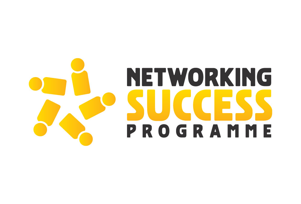
Networking Success Programme
The first was for the author of Networking for Dummies, Stefan Thomas. The concept is pretty self explanatory, but you’ll notice that the icon in isolation communicates the message of a network and achievement all at the same time. The yellow and black colour palette was chosen to reference the iconic ‘For Dummies’ book series.
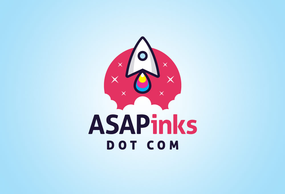
AsapInks.com
The second is for an online seller of ink cartridges. The challenge was to create something fun and memorable that suggested speed. My solution was to create a unique rocket icon (in the form of a letter A) with the flames at the bottom being in the colour of ink.
Key Takeaway: Create a story that you are passionate about and one that can evolve over time as your business does. If this story bores you now, it will bore your audience too. This part isn’t easy, but if you get it right, the juice is worth the squeeze. I’ll leave you with another quote from Paul Rand, which I feel sums this up far better than I can…
“A logo is less important than the product it signifies; what it means is more important than what it looks like.”
Do You Struggle to Create Content to Generate Sales?
We’ve Created a FREE Online Marketing Plan…
Use our simple ideas generator to help you make better content, over and over again…
Tags associated with this article
Post a comment
We'd love to know what you think - please leave a comment!
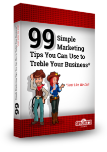
99 Simple Marketing Tips
99 Simple Marketing Tips You Can Use to Treble Your Business
Struggling to know where to start with your digital marketing?
We’ve got a tonne of ideas that you can put in place for your marketing – directly from our past 8 years growing an engaged following and strong business.
What You’ll Get
- #ToddsTips
- 4Networking
- AI
- Blogging
- Brand
- Business
- Case study
- Content
- Content Marketing
- Copywriting
- Digtial Marketing Trends
- Email marketing
- Facebook Ads
- Facebook Groups
- Facebook Live
- Google Adwords
- Hashtags
- How to
- Marketing
- Marketing strategy
- Networking
- Outsourcing
- PPC
- PR
- Press Releases
- Proofreading
- SEO
- Social
- Social Media
- Spaghetti Agency
- Storytelling
- Technology
- Uncategorised
- Video
- Video marketing
- Vision
- Websites
- Workshops
- YouTube


0 comments on this article